FYV
Lesson 7: Taking It To The Next Level
Taking
our stories to the next level means moving a little bit outside our comfort
zone. For Lesson Seven there are two options. Go with whichever one speaks to
you more and make it your own. If there are things that you’d like to go back
and improve on from previous lessons, this is a perfect opportunity.
Prompt
A: Go back to your lesson six project, where we combined storytelling style and
design style.
How
can you take this project to the next level? Think of your week six project as
a 'first draft' and here you
are coming to edit and revise for a 'final draft'.
… … … … … … …
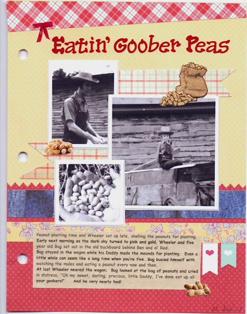
I chose Prompt A.
Although I am happy with my story, I felt I could do better with telling the
story through pictures. So – on to a new and improved scrapbook page!
I went to
Debbiehodge.com for some expert scrapbook tips.
1. Have
an intention.
My
intention is to design a scrapbook page that will compliment my story about Bug
and the peanuts.
2. Take
inventory of your givens.
· Enough
photos to tell the story. I dropped one
of the original four and kept the three that were pertinent to the story.
· Title. I changed the title from “Bug and the Peanuts”
to “Eating Goober Peas” to give the story a little more ‘oomph’ and interest.
· Journaling. I need sufficient journaling to tell the
story since the photos alone don’t.
3. Allocate
space.
Because
this is such a small page, my space is limited. I enlarged the photo of Bug and
made the other two smaller and closer in size.
This still gives sufficient white space while the focus is on the photos.
4. Shape
figure and ground
This
is a basic block form with two of the photos bumped out into the margin for
interest. I used a ‘shelf’ of blue denim
scrapbook paper and a red vintage dot paper to anchor the photos. Across the top I
used a band of red plaid – think farmer flannel shirt. The background is a
neutral yellowish tan.
5. Add
finish work.
This
is the challenging part. I don’t like scrapbook pages with lots of
embellishments; I go for simple, so I didn’t want a lot of ‘stuff.’ I used red for the title and a vellum for the
journaling instead of stark white. I tucked another patterned paper to fill in spaces
between photos. As a final touch, I added three cut-outs of peanuts around the
page.
All in all, I feel
this is a much better presentation than my previous attempt. It has more color,
more interest and shows off the photos to much better advantage. I am pleased
with the way it turned out and feel it compliments the story nicely. I am learning!

No comments:
Post a Comment